
Room Colors That Affect Your Mood in Wonderful Ways You’ll Love

Ever walked into a room and instantly felt calmer, cozier, or weirdly productive? That’s not an accident—it’s color psychology doing the heavy lifting. If your walls are whispering “meh,” it might be time to repaint with intention. Let’s talk shades that don’t just look pretty, but actually make you feel</strong amazing.
1. Sunny Yellows That Spark Joy (Without Feeling Like a Highlighter)
This image is by AI for inspiration only.
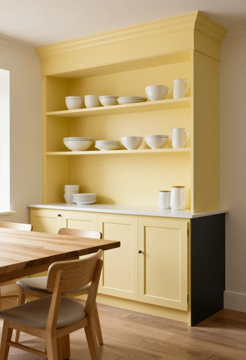
Yellow gets a reputation for being loud, but the right shade is pure happiness. Think soft buttercream or muted marigold that warms up your kitchen or breakfast nook without blinding anyone before coffee.
Use yellow where you want to feel energized and social—kitchens, entryways, creative corners. Pair it with white trim and natural wood for balance. Pro tip: avoid neon unless you’re painting a skateboard ramp.
How to Pull It Off
- Choose undertones wisely: Creamy yellows read cozy; citrusy yellows feel zippy and modern.
- Try color zoning: Paint a yellow accent wall behind open shelving to make décor pop.
- Anchor with neutrals: Add matte black hardware or gray textiles so it doesn’t skew “school bus.”
What to shop for: Warm-toned wall paint, light oak stools, white ceramic dinnerware.
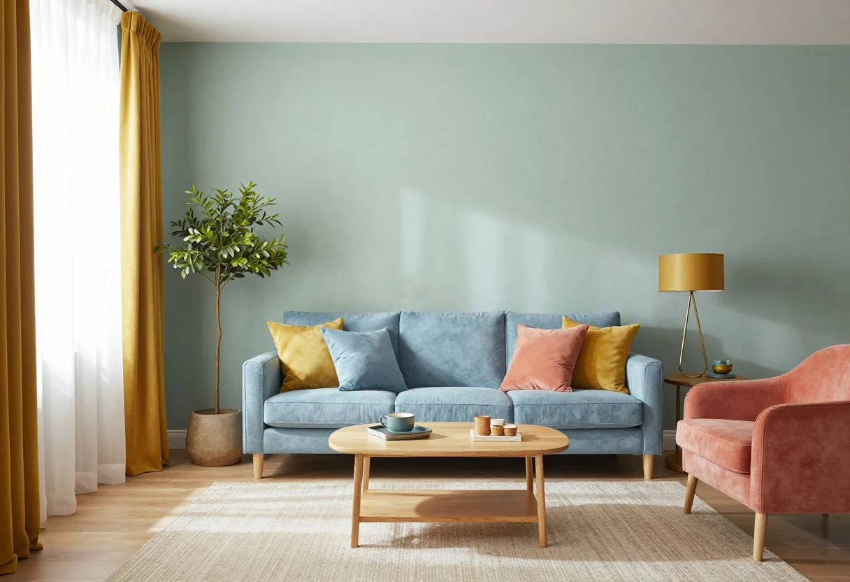
2. Serene Blues That Lower Your Shoulders Two Inches
This image is by AI for inspiration only.
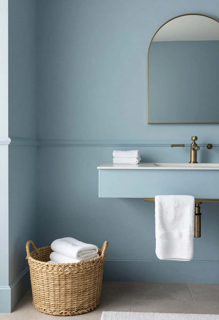
Blue is the universal deep breath. Powder, sky, or soft slate instantly cools visual clutter and calms your nervous system. It’s a go-to for bedrooms, bathrooms, and anywhere you need to relax on cue.
Lower-saturation blues help rooms feel larger and cleaner. IMO, it’s the color version of linen sheets—quiet luxury without trying too hard.
How to Pull It Off
- Keep it soft: Opt for eggshell or matte finishes for that velvety, spa-like effect.
- Layer texture: Waffle towels, brushed cotton duvets, and woven baskets add warmth so it doesn’t feel chilly.
- Mix metals: Pair blue with brushed brass or warm bronze to avoid a clinical vibe.
What to shop for: Textured bedding, woven storage, brass mirrors.
3. Grounding Greens That Make Your Space Breathe
This image is by AI for inspiration only.
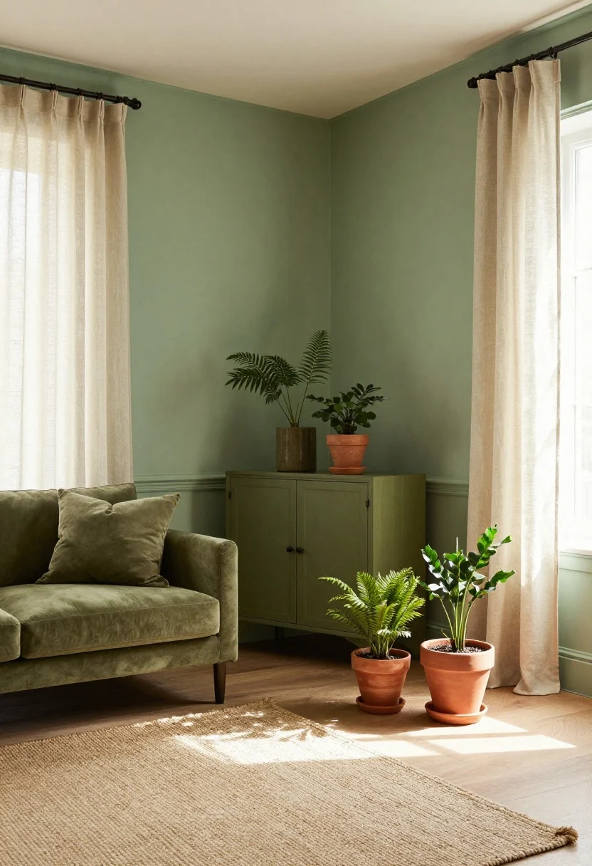
Green is nature’s neutral. Sage and olive feel sophisticated and soothing, while mossy tones add depth without going dark. If you want your home to exhale, start here.
Use green where you want steady, grounded energy—living rooms, home offices, and dining spaces. It pairs beautifully with natural fibers and terracotta for a relaxed, curated look.
How to Pull It Off
- Pick the vibe: Sage for calm, olive for chic, forest for cozy drama.
- Play with sheen: Satin on trim gives a subtle glow; matte on walls keeps it earthy.
- Bring the outdoors in: Add plants (real or realistic) to echo the palette.
What to shop for: Terracotta planters, linen curtains, jute rugs.
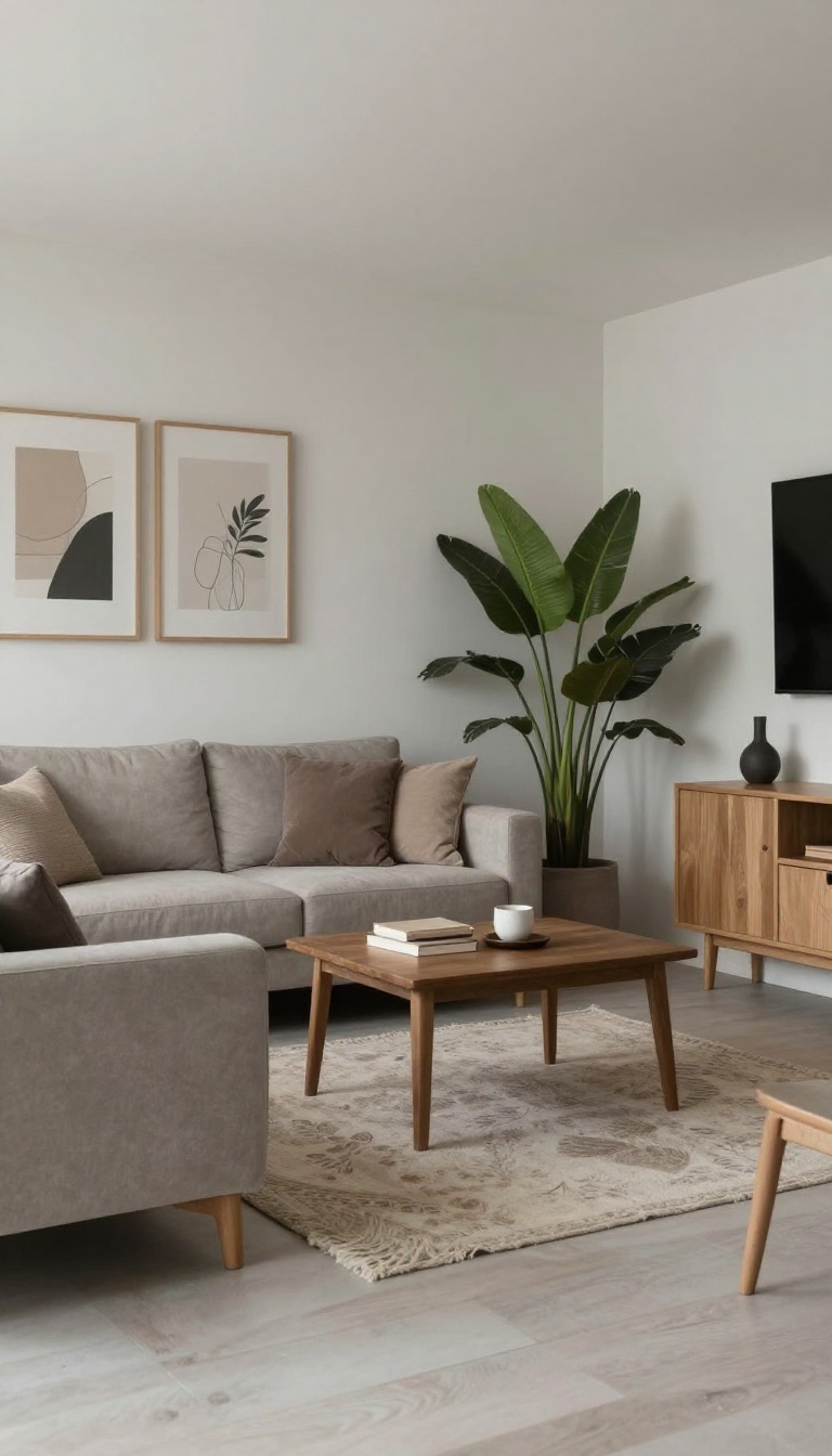
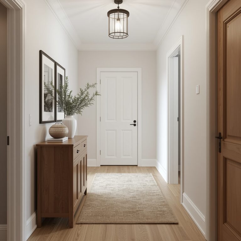
4. Cozy Neutrals That Feel Like a Warm Hug
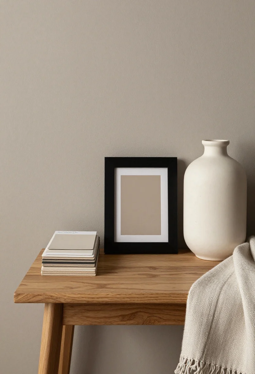
This image is by AI for inspiration only.
Neutrals aren’t boring; they’re the backdrop to your life. Greige, warm taupe, and creamy off-white make spaces feel inviting, layered, and endlessly adaptable.
They’re perfect if you love rotating décor with the seasons. FYI: undertone matters. Choose warm neutrals if your light is cool; it keeps rooms from feeling flat.
How to Pull It Off
- Go tonal: Mix three strengths of the same color (light, medium, dark) for instant depth.
- Add contrast: Black or deep brown accents keep things from going bland.
- Texture is king: Bouclé, wood grain, slub linen—mix them so the room reads rich, not beige.
What to shop for: Neutral throw blankets, black picture frames, wood side tables.
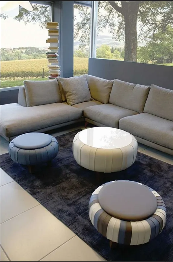
5. Energizing Reds and Corals (Used Like Hot Sauce)
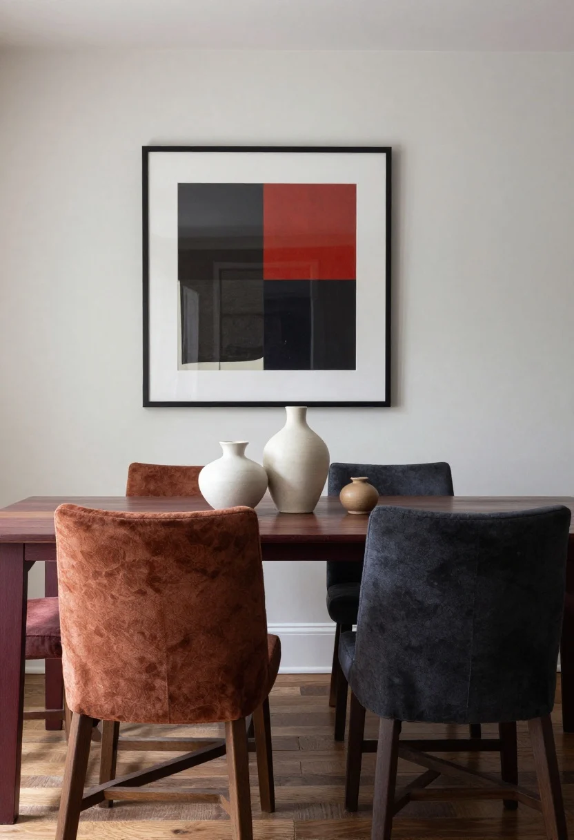
This image is by AI for inspiration only.
Red is powerful—great for rooms where you want buzz and conversation. Deep burgundy can feel luxe in dining rooms, while soft coral brings life to small powder rooms or entryways.
The trick is restraint. A full fire-engine wall can be intense, but a moody red or a dip-dyed wainscot? Chef’s kiss.
How to Pull It Off
- Choose depth: Wine, brick, and rust look sophisticated and photograph beautifully.
- Balance with cool tones: Pair with charcoal, navy, or crisp white to prevent overwhelm.
- Use in doses: Try an accent wall, painted ceiling, or inside built-ins.
What to shop for: Velvet pillows, ceramic vases, statement art prints.
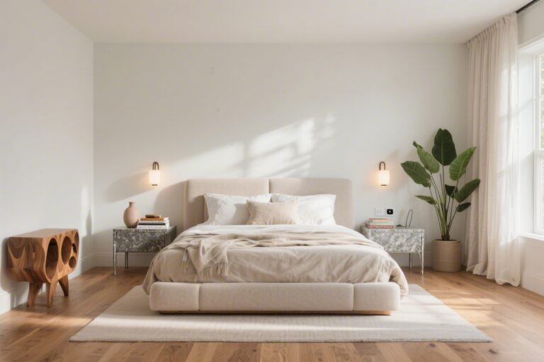
6. Peaceful Pinks and Plastery Nudes That Flatter Everyone
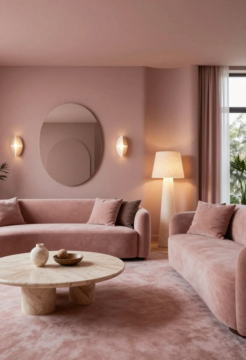
This image is by AI for inspiration only.
Blush isn’t just for nurseries. Dusty pinks and rosy nudes cast a flattering glow (hello, selfie lighting) and make living spaces feel welcoming and modern.
Think of these shades as warm neutrals with personality. They’re stunning in living rooms, bedrooms, and even hallways where you want a soft, elevated look.
How to Pull It Off
- Go muted: Look for “muddy” pinks with brown or gray undertones for a grown-up finish.
- Layer with stone: Marble, soapstone, and travertine keep the palette sophisticated.
- Lean sculptural: Curved lamps, rounded mirrors, and plaster textures echo the softness.
What to shop for: Curved sconces, linen lampshades, travertine trays.
7. Moody Charcoals and Inky Blues for Instant Drama
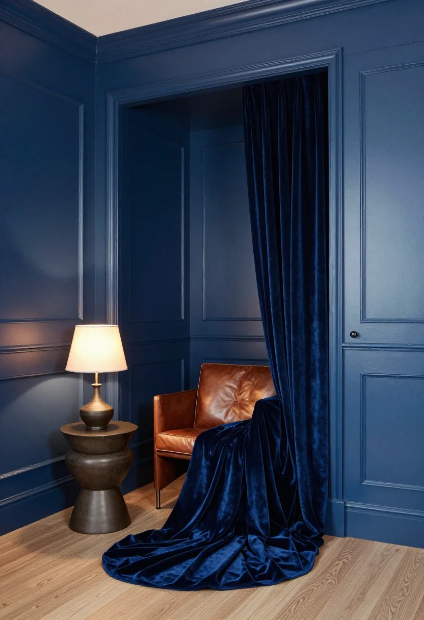
This image is by AI for inspiration only.
Dark colors do the most—in the best way. Charcoal, inky blue, and near-black create a cocoon effect that’s ridiculously chic for bedrooms, libraries, or tiny powder rooms.
Contrary to myth, dark rooms can feel bigger when edges blur. Add a little sheen on trim and metallic accents for that quiet sparkle.
How to Pull It Off
- Go tone-on-tone: Paint walls, trim, and even doors the same shade for a high-design look.
- Add glow: Warm bulbs, silk lampshades, and candles keep it moody, not gloomy.
- Contrast textures: Leather, velvet, and matte pottery read luxe against dark walls.
What to shop for: Velvet drapes, matte-black hardware, ambient table lamps.
Quick Tips for Picking Your Perfect Shade
- Test in real light: Paint large swatches and check morning, noon, and night.
- Mind the finish: Matte hides imperfections; satin scrubs clean; semi-gloss pops on trim.
- Coordinate ceilings: A lighter ceiling opens things up; a darker one feels cozy and architectural.
- Use the 60/30/10 rule: Main color 60%, secondary 30%, accent 10% for balance.
Conclusion
Your walls are more than a backdrop—they’re mood-setters. Choose colors that match how you want to feel, and let the rest of the room follow. Small paint can, big life upgrade. You’ve got this.
FAQ
Q: What’s the best color for a small room?
A: Light colors make small rooms feel airy, but don’t be afraid of dark shades—inky walls with matching trim can blur edges and feel surprisingly spacious.
Q: How many colors should I use in one room?
A: Stick to a tight palette: one dominant, one supportive, and one accent. Use variations in texture and tone to keep it interesting without visual chaos.
Q: Which paint finish should I pick for high-traffic spaces?
A: Satin or eggshell on walls for easy wipe-downs, semi-gloss on trim for durability and definition, and matte in low-traffic areas where you want that soft, luxe look.
Shop the Look on Amazon
Disclosure: As an Amazon Associate, this site may earn from qualifying purchases.
These product categories fit this article and give readers an easy next step when they are ready to shop.
- Tranquil Walls — Supports relaxation and serene moods in bedrooms.
- Cozy Grounding — Adds warmth and comfort for welcoming spaces.
- Bright Accents — Boosts positivity and light in living areas.
- Restorative Touch — Promotes balance and calm with natural tones.
- Soothing Layers — Creates gentle, nurturing ambiance in lounges.
Image Credits:All images are used for informational or inspiration purposes only. Some images used in this post are sourced from royalty-free websites like Pixabay or created using Canva Pro. If you are the copyright owner of any image used here and would like it removed or credited, please contact me.


One Comment